Apple’s name and logo are among the most recognizable in the world of technology. Founded by Steve Jobs, Steve Wozniak, and Ronald Wayne in 1976, the brand has seen significant evolution over the years. The original Apple logo featured Isaac Newton reading under a tree, symbolizing the pursuit of knowledge and innovation.
The current logo, a sleek apple with a bite taken out of it, was designed by Rob Janoff. This minimalist design embodies the brand’s commitment to simplicity and user-friendly technology. Apple’s decision to move from a detailed emblem to a plain design reflects its shift towards contemporary aesthetics.
Apple’s name complements its logo. The name “Apple” was chosen by Steve Jobs to appear ahead of Atari in the phone book and to project a friendly image. Apple’s brand identity is built on simplicity, innovation, and approachability, making it a leader in technology and design.
1. The Name “Apple”
- Why “Apple”?
Steve Jobs reportedly chose the name Apple in 1976 because he wanted something simple, friendly, and approachable—very different from the cold, technical names of other computer companies at the time (like IBM or Xerox). - Other reasons behind the choice:
- Jobs was a fruitarian at the time and had recently visited an apple orchard.
- The name would appear ahead of competitors like Atari in the phone book.
- It conveyed freshness, simplicity, and accessibility.
The name has since become synonymous with innovation, design, and creativity.
2. The First Apple Logo (1976)
- Designed by Ronald Wayne, Apple’s short-lived third co-founder.
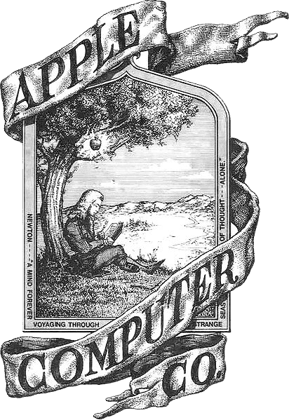
- It depicted Isaac Newton sitting under an apple tree, with a quote from William Wordsworth.
- While artistic, it was far too complex for branding and lasted less than a year (source: Crowdspring).
3. The Rainbow Apple (1977–1998)
- In 1977, Rob Janoff created the now-iconic bitten apple silhouette.
- It featured rainbow stripes, symbolizing Apple’s commitment to making computers accessible and with color graphics.
- The “bite” was added for two reasons:
- To distinguish it from a cherry or tomato.
- As a playful nod to “byte,” a computer term.
This design became one of the most recognizable corporate logos in history.
4. The Monochrome Era (1998–2000s)
- When Steve Jobs returned in 1997, he simplified Apple’s branding.
- The rainbow stripes were replaced with a sleek monochrome apple—a reflection of Apple’s minimalist design philosophy.
- Variations included aqua blue, chrome, and black to match Apple’s product lines.
5. The Modern Apple Logo (2000s–Present)
- Today, Apple uses a flat, minimalistic apple silhouette—usually in silver, white, or black.
- It adapts fluidly across devices, packaging, stores, and digital platforms.
- The design embodies Apple’s brand values: simplicity, elegance, and universality (source: Fabrik Brands).
6. Symbolism and Meaning
- Innovation & Knowledge: The apple is a universal symbol of knowledge (think Newton’s apple, or the biblical fruit of knowledge).
- Approachability: The friendly, non-technical image helped Apple stand out from competitors.
- Bite/Byte Pun: A subtle reminder of the company’s tech roots.
- Timelessness: The logo works across eras without needing radical redesigns.
7. Fun Facts
- The bite in the apple has no connection to the story of Adam and Eve—it was purely a design choice.
- The logo is so iconic that Apple doesn’t even need to put its name next to it.
- Apple’s logo is now considered one of the most valuable brand symbols in the world, with the company’s brand worth estimated in the hundreds of billions.
✅ In summary:
Apple’s name was chosen for its simplicity and friendliness, while its logo evolved from a complex Newton sketch to the sleek, minimal bitten apple we know today. Together, they’ve become symbols of innovation, creativity, and design excellence.
The Evolution of a Tech Icon
The First Apple Logo
Apple’s initial logo, designed in 1976 by co-founder Ronald Wayne, featured a detailed illustration of Isaac Newton sitting under an apple tree. This intricate design was quickly deemed too complex and replaced within a year.
The Rainbow Apple
In 1977, Steve Jobs commissioned graphic designer Rob Janoff to create a new logo. Janoff’s design, a colorful, bitten apple, became an iconic symbol of the brand. The rainbow colors represented the Apple II computer’s ability to display color graphics, a groundbreaking feature at the time.

The Monochrome Apple
In 1998, Apple transitioned to a simpler, monochromatic version of the logo. This change coincided with the return of Steve Jobs as CEO and marked a shift towards a more minimalist aesthetic.
Variations and Modernizations
Over the years, the Apple logo has seen subtle variations in color and shading. The current version is a sleek, silver apple with a gradient effect. Despite these changes, the basic bitten apple shape has remained consistent, symbolizing Apple’s commitment to innovation and user-friendly technology.
Table: Apple Logo Evolution
| Year | Logo Design | Description |
|---|---|---|
| 1976 | Newton Plaque | Detailed illustration of Isaac Newton under an apple tree |
| 1977-1998 | Rainbow Apple | Colorful, bitten apple with a rainbow spectrum |
| 1998-present | Monochrome Apple | Simplified, bitten apple in various colors and finishes |

Key Takeaways
- Apple’s first logo featured Isaac Newton.
- The current bitten apple logo was designed by Rob Janoff.
- The name “Apple” was chosen for its simplicity and position in the phone book.
The History and Evolution of Apple’s Brand
Apple’s brand has seen significant changes and developments since its inception. From its origins and the initial logo design to logo transitions over the years, Apple’s branding journey is intriguing.
Origins and Founders
Apple was founded in 1976 by Steve Jobs, Steve Wozniak, and Ronald Wayne in a garage in Los Altos, California. The founders had a vision to create personal computers. Steve Jobs became the face of Apple, bringing his unique style and vision to the company. Ronald Wayne designed the first Apple logo but soon left the company. Steve Wozniak acted as the engineer, turning innovative ideas into working products. This blend of roles helped lay the foundation of Apple.
The Making of a Logo
The first Apple logo, designed by Ronald Wayne in 1976, depicted Isaac Newton sitting under an apple tree. It was intricate and detailed, far from today’s sleek design. The logo included a phrase: “A Mind Forever Voyaging Through Strange Seas of Thought Alone.” In 1977, Rob Janoff created the now-famous “bitten apple” logo. The bite served to distinguish the apple from other fruits and played on the word “byte,” linking it to technology. The logo’s rainbow stripes were a nod to Apple’s pioneering role in color displays.
Logo Transition Over Time
Throughout the years, Apple’s logo has transformed multiple times. From the original rainbow design, it later shifted to a monochrome look in 1998. This change aligned with Apple’s new product design language, focusing on minimalism and modern aesthetics. The chrome logo came next, giving a polished, sleek look that matched their growing brand status and recognition. In recent years, Apple has returned to a flat, monotone design, enhancing simplicity and consistency across their products and branding materials.
Significance and Symbolism
The Apple logo is not just a design element; it holds deep symbolism. The bite in the apple has diverse interpretations, one being the biblical reference to the “forbidden fruit.” Some also associate the bite with Alan Turing, the father of computing, who allegedly committed suicide by eating a cyanide-laced apple. The logo’s constant evolution represents Apple’s commitment to innovation and excellence. The transition from rainbow colors to monochrome underscores their journey from being a colorful disruptor to a sophisticated tech giant.
This evolution of Apple’s brand, from its garage beginnings to its iconic status today, reflects its journey of innovation and change in the tech industry.
Frequently Asked Questions
This section addresses common inquiries about Apple’s name and logo, providing insights into its history, symbolism, and the choices behind its iconic design.
Why is the Apple logo represented by a bitten apple?
The Apple logo is a bitten apple to differentiate it from a cherry. The bite gives it a sense of scale, making it clear that it is an apple.
What is the history behind Apple’s logo design?
Apple’s first logo in 1976 depicted Isaac Newton under an apple tree. This detailed scene was soon replaced with a more modern design.
How did Apple Inc. choose its name and logo?
Apple’s name was chosen by Steve Jobs. He wanted a name that was simple, fun, and not intimidating. The logo followed to match the friendly concept.
What are some of the interpretations of the Apple logo’s meaning?
Some interpretations of the Apple logo suggest it represents knowledge and enlightenment. The bite in the apple is also linked to computing terminology.
Can you trace the evolution of the Apple logo from 1976 to the present?
The Apple logo has evolved from a complex illustration in 1976 to a minimalist and sleek bitten apple. Changes included rainbow stripes, monochrome, and chrome finishes.
What does the bitten apple in the Apple logo symbolize?
The bitten apple in the logo symbolizes knowledge. It can also be seen as a playful reference to the byte in computing, aligning with Apple’s tech roots.


